Design/Projects/Improve mobile reading experience
Providing a good reading experience is of high importance to Wikimedia projects. Typography, and specifically font choices, build the base for readability regardless of the device, software, or language of our readers.

Goals and summary
[edit]Our current font choice for sub-headlines and running text on mobile – sans-serif – builds on a generic font stack for historical reasons. This results in using Arial or Helvetica in latin languages on the majority of browsers. Both fonts mildly support the web's universality and have been the primary choice when supporting the widest variety of users like we do.
Driven by emerging mobile operating systems (OS) and strong growth in markets aside of latin script languages, in the last few years system manufacturers have been introducing new default fonts. These "system fonts" aim to provide better readability and better support for more languages available.
These typefaces
- deliver a better native experience for readers,
- improve cross-platform and
- improve cross-language readability.
Who will see this change?
We would like to use these system fonts in our selection fonts for the mobile interface presented by Minerva Neue.
Technical background
[edit]You can read more on the technical backgrounds in the Phabricator task.
Proposed system font stack (see discussion on task):
/**
 * System font stack
 *
 * `-apple-system` – Support: Safari for macOS and iOS ('San Francisco')
 * `BlinkMacSystemFont` – Chrome < 56 for macOS ('San Francisco')
 * `Segoe UI` – Windows Vista & newer
 * `Roboto` – Android
 * `Lato` – Wikimedia Design choice, OFL licensed
 * `Helvetica, Arial, sans-serif` – (Generic) Web fallback
 * Note that standard `system-ui` value has resulted in unresolved side-effects in certain OS/language combinations and is therefore not included as of now.
 */
font-family: -apple-system, 'BlinkMacSystemFont', 'Segoe UI', 'Roboto', 'Lato', 'Helvetica', 'Arial', sans-serif;
This CSS rule will apply the first font in the stack that is available. This is part of open web standards in most browser rendering engines. For example, Roboto is the Android operating system's current default font. None of the first three fonts are on Android systems by default. So, Roboto is selected for rendering the content. Note the code style following our stylelint enforced coding conventions.
To put another way the logic of this CSS rule:
User system default > Wikimedia Design choice (Lato) > User operating system desktop only ( Helvetica > Arial) > generic sans-serif With this font stack we're covering at least 89% of mobile browsers outside of generic Helvetica or Arial covered systems in April 2019. The biggest exceptions share-wise are UC Browser Mini and browser sub-summed as “Other” where a big part might still be Chromium/Android based and therefore receive 'Roboto'.
Problem statement
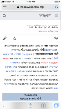
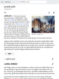
[edit]Currently relying on web browser default font choice, which is, out of historical reasons often Arial and Helvetica as least common denominator with the widest language script support. But both fonts date back more than a dozen years.
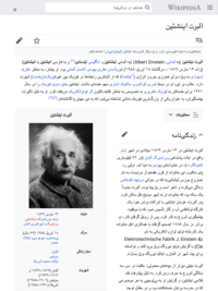
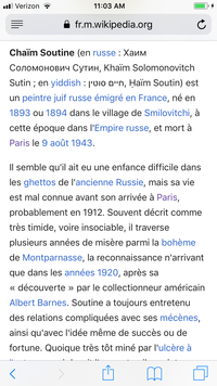
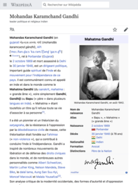
Comparison screenshots
[edit]| Language | OS | Device | Page | Before | After |
|---|---|---|---|---|---|
| en | iOS | phone | Tao Te Ching | 
|

|
| en | iOS | tablet | Tel Aviv | 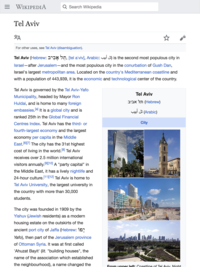
|

|
| en | Android | phone | Gautama Buddha | 
|
(no change) |
| en | iOS | tablet | Portal | 
|

|
| fa | iOS | phone | آلبرت اینشتین | 
|

|
| fa | iOS | tablet | آلبرت اینشتین | 
|
|
| fr | iOS | phone | Chaïm Soutine | 
|
|
| fr | iOS | tablet | Mohandas Karamchand Gandhi | 
|
|
| he | iOS | phone | מוהנדס קרמצ'נד גנדי | 
|
|
| he | iOS | tablet | ארכימדס | 
|

|
| he | Android | phone | גאוטמה_הבודהה | 
|
(no change) |
| hi | iOS | phone | फ़्रान्सीसी क्रान्ति | 
|

|
| hi | iOS | tablet | फ़्रान्सीसी क्रान्ति | 
|
|
| ja | iOS | phone | 
|

| |
| ja | iOS | tablet | 
|

| |
| ja | Android | phone | 
|
(no change) | |
| my | iOS | phone | 
|

| |
| my | Android | phone | 
|
(no change) | |
| nv | iOS | phone | 
|
(no change) | |
| nv | Android | phone | 
|
(no change) | |
| ru | iOS | phone | 
|

| |
| ru | iOS | tablet | 
|

| |
| ru | Android | phone | 
|
(no change) | |
| vi | iOS | phone | 
|

| |
| vi | iOS | tablet | 
|
(no change) |
Updates
[edit]2019-03-01
[edit]- Wikipedia Portals has been changed to new font stack, with it's variety of language scripts a good, encapsulated place to start.
2019-04-08
[edit]- Mobile web (MinervaNeue) has adopted the new font stack, see for example English or Chinese Wikipedia.
Prior art
[edit]There have been a few other web institutions facing similar challenges and taken a similar path:
- https://blog.cleartrip.com/2017/02/20/design-nuances-cleartrip-now-feels-more-at-home/
- https://booking.design/implementing-system-fonts-on-booking-com-a-lesson-learned-bdc984df627f
- https://medium.com/@vojtechjurasek/how-we-decided-to-use-system-fonts-87683b9b23ba
- https://css-tricks.com/snippets/css/system-font-stack/
In 2014 there has been a project “Typography refresh”, which had included font stack changes with similar goals but before mobile operating systems penetration were as high. Apart of the prior art projects we have evaluated findings from this project as well to inform our font stack proposed here.
Further links
[edit]- Introductory blog post on `-apple-system` for Webkit (Safari)
- Deprecating task for
BlinkMacSystemFontin favor ofsystem-uifor Blink (Google Chrome)
Article/wiki examples of scripts under focus for being taken care of by the proposed change:
- https://en.m.wikipedia.org/wiki/Tie_(typography)
- https://ja.m.wikipedia.org/w/index.php?title=%E3%83%A1%E3%82%A4%E3%83%B3%E3%83%9A%E3%83%BC%E3%82%B8
- https://nv.m.wikipedia.org/w/index.php?title=%C3%8Diyis%C3%AD%C3%AD_Naaltsoos
- https://vi.m.wikipedia.org/w/index.php?title=Trang_Ch%C3%ADnh
- https://zh.m.wikipedia.org/w/index.php?title=Wikipedia:%E9%A6%96%E9%A1%B5
