Translation UX/Wireframes A
Appearance
Proposed by Pau
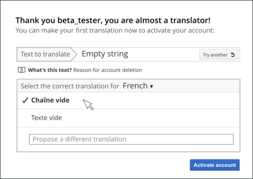
Translation registration process
[edit]

Ideas applied:
- Make language selection the first step so the user starts with a translation-related activity.
- Provide a log-in link in case the user has an account already.
- Show easy messages to translate for newcomers (short messages with info and suggestions).
- Provide a translation limit for new users. Initial translations are not directly published.
- Present user account validation as an upgrade to the user.
- Use checkbox-based captcha.
Translation workflow
[edit]
Ideas applied:
- Layout based on a right sidebar where context information is located (left: message code, original message, translation and actions; right-side: information, suggestions, related translations and help).
- Emphasize original message text and located closer to the translation box.
- Easy change between projects and sub-projects.
- Show fuzzy translations with a specific label.
- Once a translation is saved, a confirmation appears informing about other languages the translation is lacking (from the ones the user speaks) .
Searching
[edit]
Ideas applied:
- Search first, filter later. Filter column on the left appears after making the search.
- Avoid results to be repeated when appear for multiple languages.
- Provide links to translate messages lacking translations.
